Lecture at Parallel School Lausanne, 11 September 2015
This lecture looked at art school corporate identities in London. I focused on schools that were recently rebranded and discussed the intentions behind these rebrands to point at the politics that are hidden beneath the apparently innocuous surface of a logo.
Rebranding the art school: ‘Business as usual’
Let’s begin with Europe's largest arts university – the University of the Arts London (UAL). Their current logotype [a], designed by Pentagram in 2012, has remnants of Modernism with its use of Helvetica bold. This system replaces the constellation of the previous identity [b], on which each of the stars represented a school mapped geographically. [1] Although the previous identity was deemed too complicated and difficult to use, it undeniably showed a spirit and a character that are cruelly lacking in the new logo.
Domenic Lippa, partner at Pentagram, acknowledged the simplicity of the logo. He said Helvetica was chosen because of its ‘neutrality’, even congratulating himself because Pentagram ‘didn’t try to over-complicate it and try too hard…The temptation is to make something “too” designed. [2]
Although avoiding overdesign is commendable, the choice of neutrality as the main concept behind the identity sounds surprising for an art school: such institutions were historically linked with experimentation, new ideas and refusal of conventions – ultimately standing out for their positions rather than trying to blend in.
Lippa stresses that it is the work produced within the colleges that will provide the ‘colour and flair’ in the identity, effectively washing his logo from any meaning, instead turning it into an empty shell. With that in mind, one is left to speculate whether Pentagram simply produced a bland logo that would have been better suited for a law firm, or whether their design is charged with a critical, ironic agenda – could the logo be a reflection of the corporate governance the university has adopted?
a. UAL's current logo
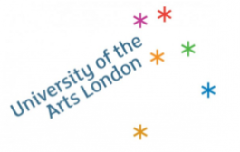
b. UAL's previous logo
1. The former logo was developed by UAL students, before being finalised by branding agency Lloyd Northover in 2004.
2. Burgoyne, Patrick, ‘Opinion: UAL Identity Creative Review’, Creative Review, June 2012 [accessed 1 August 2015]
In times of austerity, UK universities have had to reconsider their models – once based on low or inexistent fees and student loans which granted everyone access to education, regardless of their background – and have embraced a profits-orientated approach, turning education into a lucrative commodity. Art schools are no exception to the rule, and the conglomerate that UAL has become, gobbling up smaller schools, is perhaps the most telling example in the sector; it is run like an enterprise.
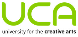
Although we will be left to speculate on Pentagram’s real intentions, the 2015 redesign of the University for the Creative Arts (UCA) [c] by Spin leaves little ambiguity as to their brief.
Indeed, the previous logo [d] would have been more appropriate for a medical corporation, or perhaps a football organisation; a distinct hindrance in times when rising fees make students highly selective in their choice of institutions. UCA had no choice but to market itself as a forward-looking, dynamic place to study.
c. UCA's current logo
d. UCA's previous logo
1. The former logo was developed by UAL students, before being finalised by branding agency Lloyd Northover in 2004.
Surprisingly, students were not so happy about the redesign. A petition was started, asking to revert to the original logo. Online comments by students were rather amusing – a personal favourite is a student who wrote that ‘it looks like a Swastika if you were to move the matches around,’ providing us with yet another proof of Godwin’s law. Another student wrote ‘this logo is an embarrassment, a bit like the uni itself.’ Although mildly entertaining, these comments highlight something uneasy. If the university is not that great, and neither are its students, then the logo turns into a car salesman – repackaging a passable institution in a much nicer envelope. After all, it is easier for a university to change its logo than for a logo to change the university.
These two examples show opposite results. Nevertheless, they share radical rebrands that try to reposition the universities and appeal to bigger or better markets. But there are subtler examples, such as the Royal College of Art’s (RCA) 2013 refresh of the ’90s logo. Delivered by Neville Brody, the new logo is very close to the previous, keeping the royal crest and Calvert font – just ragging left what was then centred. [e, f] A new headline typeface, Calvert Brody, was developed in collaboration with type designers Margaret Calvert and Henrik Kubel. The stencil font was used among other things for the signage in the recently built Dyson building, located on Battersea campus.
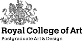
e. RCA's current logo
f. RCA's previous logo
In his review of the building, architecture critique Oliver Wainwright describes the gallery placed on the ground floor of the Dyson building, with floor-to-ceiling windows facing the street, as ‘something of a “shop window” for the college to sell its wares’. Everywhere, spaces are ‘arranged and views framed to heighten the theatre of production.’ What is put forward is the representation of production – the image is acting as a bait for prospective students, but also for and donors and sponsors, luring them into largesse and partnerships. Perhaps the windows are tell-tales of a management that might care more about providing a review-friendly ‘experience’, rather than an education.
In these three cases, it seems that although the visual scenario is different, the politics are the same: an attempt to follow the market and attract a steady stream of fee-paying students. Universities use visual cues as placeholders for an experience, rather than letting their education speak.
However, prospective students are not necessarily duped by these empty shells and have come to question the art factories. Indeed, the number of alternative educations ‘systems’ is flourishing. Mostly active in fine arts education, these schools provide free education in alternative locations, and are often well-connected to their local communities. The most famous example is Open School East, located in a former library; but in terms of branding, my personal favourite is the School of the Damned. Its logo? A farting devil.