Article for Weltformat published in Poster Tribune 11, 2019.
Framed Reality
There is a special place in designers’ hearts for commissions that are destined to other designers. Whether it is a book on books or a poster for a poster festival, these projects are perceived as spaces that allow pushing design concepts further than in usual commissions. And if a design festival’s theme is “Tools & Rules”, its visual identity turns into an opportunity for an even more reflexive approach. It is very appropriate, then, for Weltformat to have chosen Maximage as the designers of this year’s identity. From their earliest projects, they have been developing design tools that either circumvent or supplement those readily available. To mention a few, they have intervened directly on offset plates (in various projects from 2008 to 2013), modified visuals through sound software (Les Urbaines 2015) or developed a colour separation process that expands the possibilities of spot colour printing (colorlibrary.ch, launched in 2017). To find more about the ideas they were developing for this year’s identity, I caught up with Maximage at their London studio, where David Keshavjee showed me prototypes – the work was still in progress when we met – and explained the process behind the identity.
Maximage’s constant strive to develop new methods is driven by their belief that “creating your own tools helps to distantiate from existing ones since these can lead to visual repeats.” Devising their own approaches allows them to break the unconscious rules that govern existing tools. It also enables them to become their own clients within a commission: “even drawing a typeface for a project is creating a tool for yourself that you then apply to the job.” For the identity of Weltformat, the designers pushed the logic further. Rather than creating a corporate identity, they proposed an app that interprets visual inputs and translates them in unstable animations and images.
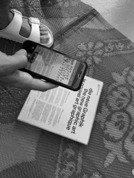
David Keshavjee translating die neue Graphik to Japanese with Google’s Translate app.
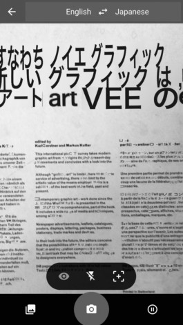
It all started when Google rolled out a new tool for its Translate app. Instead of typing or speaking to translate, Google made it possible to use the phone’s camera and see live augmented reality (AR) translation superimposed in the image feed. Rather endearingly, the Translate app also attempts to match the original image’s colours, fonts and layout. By interpreting the design of the input, it often creates a bastardized version of the original. “When this tool came out, we found it so great. It tries to adapt to the existing design, which leads to bugs. Sometimes, it changes words; sometimes, the app sees typography where there is none.”
Finding Weingart in the grid
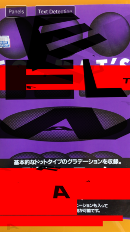
Working with Milk Interactive in Zurich, who is taking care of the programming, Maximage conceived an app that would similarly attempt to translate the world into its own interpretation. In a tongue-in-cheek reference to designers’ fundamental tool, they devised a system that attempts to find grids in visual inputs and superimposes typography where it finds them. When I visited their studio, David demonstrated a prototype of the app by aiming at Grid systems. Just like Google Translate, the app refreshed its interpretation of the iconic cover at high speed and created a sometimes comical animation with components from the Weltformat logo flying in all directions. “They look like ants trying to work out where the grids are,” David remarked. And they would certainly have been ants in Müller-Brockmann’s pants: the cover of Grid systems triggered a flickering, disjointed AR homage to Weingart that covered the original with a large W. Considering how much Weingart’s designs were linked with technical progress, the app’s unsuspecting tribute felt rather appropriate.
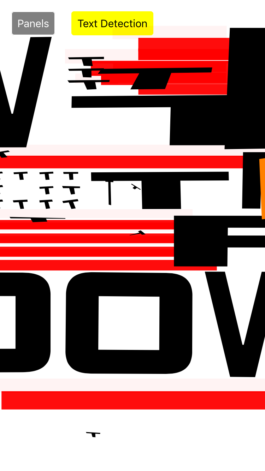
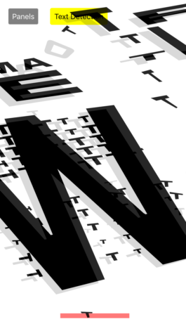
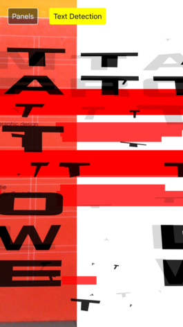
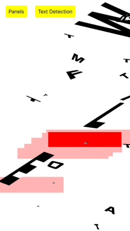
“Text Detection” mode with the white background activated.
The humour of hiding and replacing original designs with their own was obviously not lost on Maximage, who included a “Text Detection” mode that censors anything resembling text with red bars. When the mode is combined with another setting that replaces the original image with a white background, the result is not without recalling some of the visual vocabulary used by Willi Kunz – lines and blocks arranged in staircases – although here these elements have come to life. It was the same Kunz who feared that the facility of design software, which had eliminated the need for traditional technical standards and allowed typography to become more experimental, could potentially lead to the loss of the governing principles of communication behind it.¹ Indeed, the visuals created by Maximage’s app could not care less about fundamental principles of typography. To be fair, however, the app is not so much about communicating as it is about experimenting and creating new tools.
1. Willi Kunz, Typography: Macro And Microaesthetics, 2nd edn, Sulgen: Niggli, 2002, p. 5–6.
In fact, the app was not conceived with a single purpose in mind (such as designing the poster, for instance). In Maximage’s studio, a wall was covered with printouts of both AR outputs and gridded squares to see how the app reacts to them. When I wondered if one of them would be the poster, David explained that “at this stage, we don’t have a poster. We have some ideas, of course, but we are just focusing on developing the tool. We need to discover what is possible. We have been playing with the app and looking at the possibilities to create a corporate identity with it.” And when an application is needed, such as animations for the website or even the poster, “it will happen very quickly, the process will be very intuitive.” Before then, there are still some questions that the designers want to clarify. “AR is not related to print, it belongs to the digital world, to social media. How can we translate it for print? It cannot be a simple printout of the app’s output… We are still defining what it could be.” Ultimately, all the visual material will either be designed with the app or conceived with its use in mind. The identity is thus rooted in the digital tool rather than imagined from its endpoint perspective: the method creates the visual instead of the other way around.
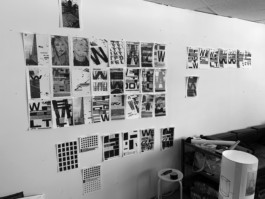
Testing the app in the studio: outputs and potential inputs.
Focusing on the tool rather than its application is what gave the designers room for experimentation. “When we decided to develop the app, we wondered what could be a new and conceptually interesting way of using AR. Normally, its use is pretty limited: it recognises a set image or symbol and triggers an animation. Here, what was interesting for us is that the machine tries, in its own clumsy way, to translate any input.” Any compositional rules come from the image. While the app attempts to find and highlight existing grids, its limitations mean that the output often does not fit within a recognisable grid. “The identity also talks about the limits of a technology that is not slick, but that tries to interpret the world.”
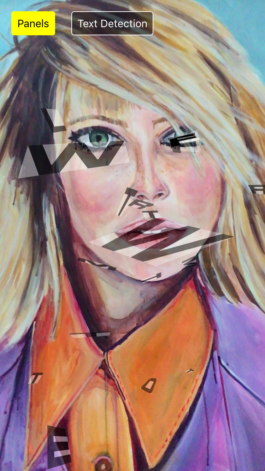
The limits are indeed where the novelty lies. As David pointed out, the generated layouts are not those a designer would normally come up with. In fact, some of the most interesting ones come from the two extremes types of input fed in the app – subjects with highly defined grids or none at all. For instance, aiming the app at the painting of a face sends back a volley of disjointed letters that manically fly around, while testing it on Müller-Brockmann’s three-dimensional grids produces a perfectly formed layout.
There is an appeal to generative design and the idea that an unlimited amount of visuals can be deployed from a set of rules. But if a thousand possible solutions can be created, what is the inherent value of each visual? Is it important to stop, pick a possibility and develop it? “Both are interesting. The process of generative design allows getting out of the tools we already have, such as InDesign. Then, within that, we look for what’s interesting in the new shapes. We do not correct them too much: we take into account the mistakes and select results which are promising.” Furthermore, Maximage are not simply providing visuals to the festival. Instead, they are giving access to the AR app to the general public. The designers are tool makers rather than the providers of visual content, and this feels particularly relevant in the age of Tik Tok videos and viral face filters. With this year’s identity, Maximage remain true to their motto, “emotion and technology”: “what we’re providing is the identity of a graphic design festival, which talks about tools and whose main audience is graphic designers. It is fitting to explore processes and present the idea that tools are great gateways to freedom. If the public gets that, we will have achieved what we wanted.”
